Getting Started – DDA Reports in the App
DO-MS is an application to visualize mass-spec data both in an interactive application and static reports generated via. the command-line. In this document we’ll walk you through analyzing an example dataset in the interactive application.
Table of Contents
- Example Data
- Installation
- Data Import
- Subsetting Experiments
- Interacting with Modules
- Generate Report
Example Data
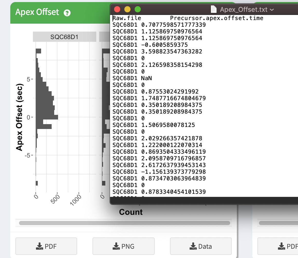
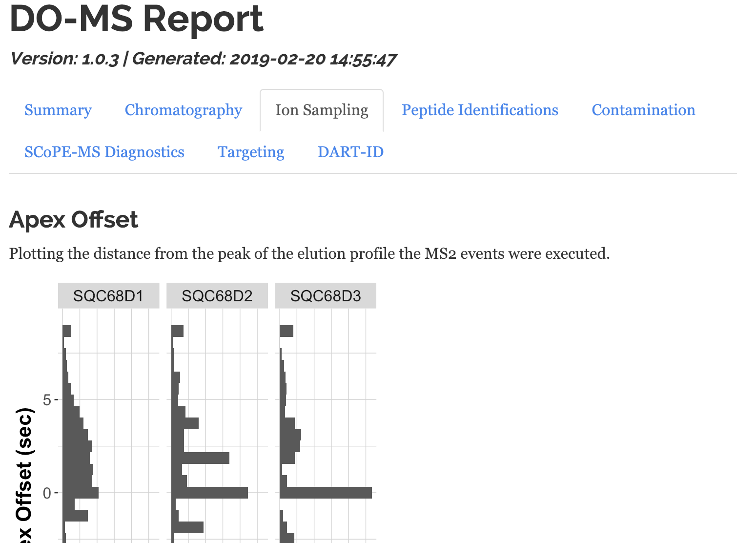
We have provided an example data set online, SQC68, which was used for the Apex Offset figure in the DO-MS paper. You can download a .zip bundle of it here: https://drive.google.com/open?id=1hcWDtnD9MzTZbF-qc0rGEFUBZgtlEQTv. The contents of the archive are some of the outputs of the txt folder from a MaxQuant search.
The only constraint for data in DO-MS is that it must be from MaxQuant version >= 1.6.0.16.
Installation
Please make sure that you installed DO-MS as descibed in the installation section. Note that DO-MS has to be configured for MaxQuant data. Find out More
Data Import
![]()
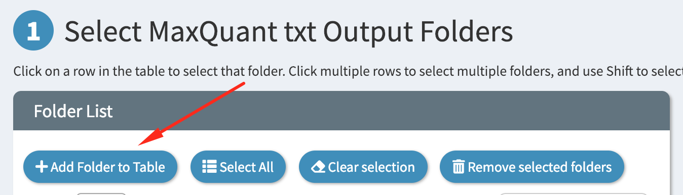
Adding Folders
DO-MS is designed to load folders of analyses rather than individual files. To allow quick access to your analyses, as well as to allow analyzing multiple searches simultaneously, DO-MS provides a searchable “folder table” for all of your analyses. To begin, we must first add some MaxQuant searches to the table.
Start by clicking the “Add Folder” button at the top of the table
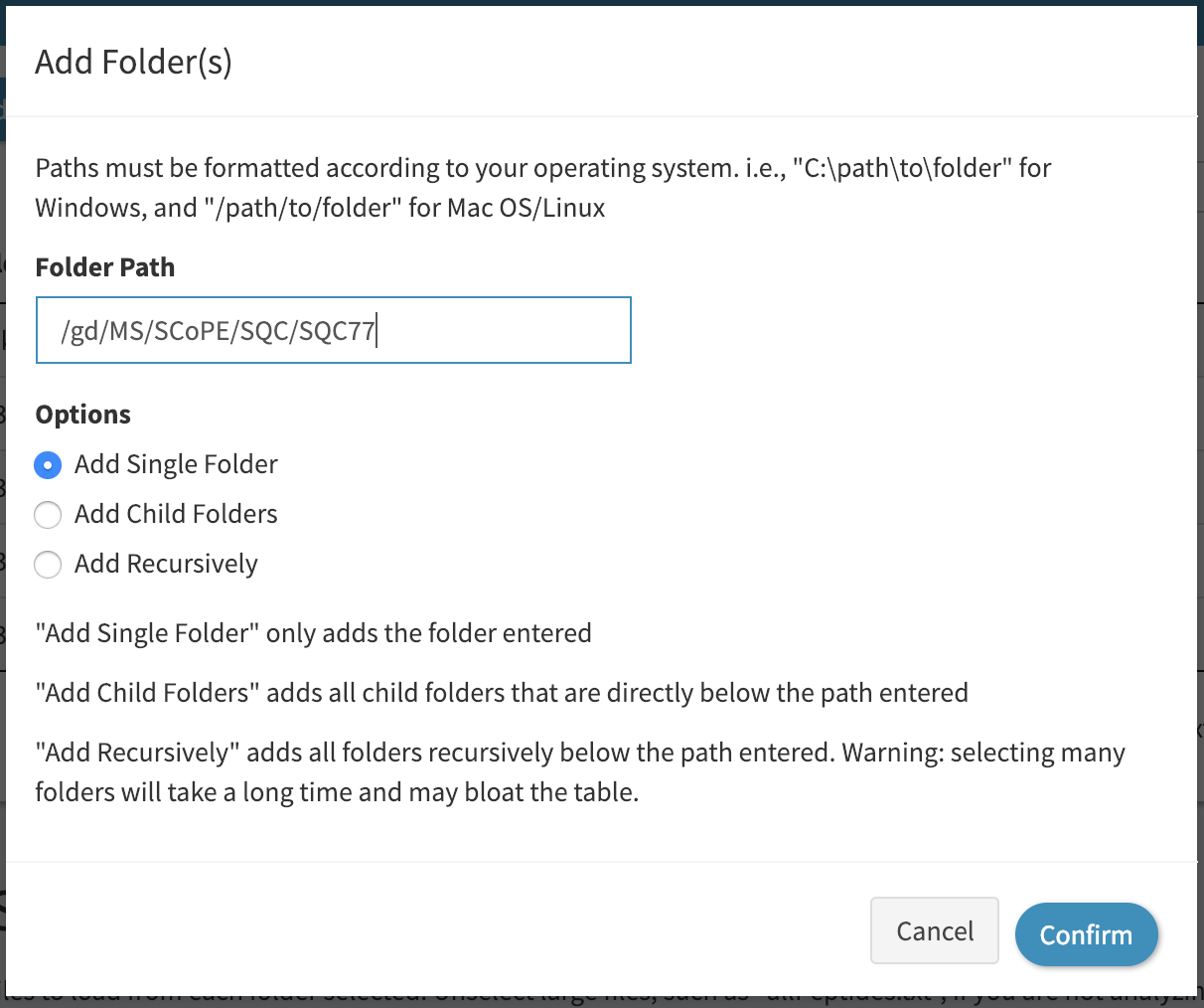
Then add the path of your folder into the textbox, as shown:
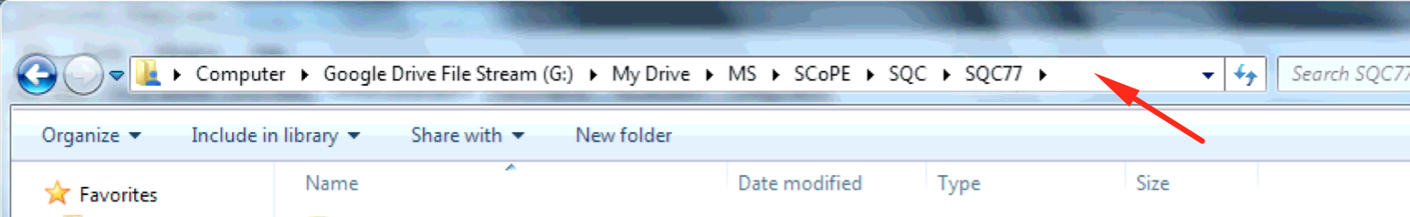
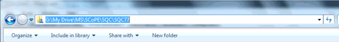
A folder path is the folder’s absolute location on your machine. On Windows, you can get the folder path by navigating to it in Explorer, clicking on the top file path bar, and copying the resulting text with Ctrl+C.
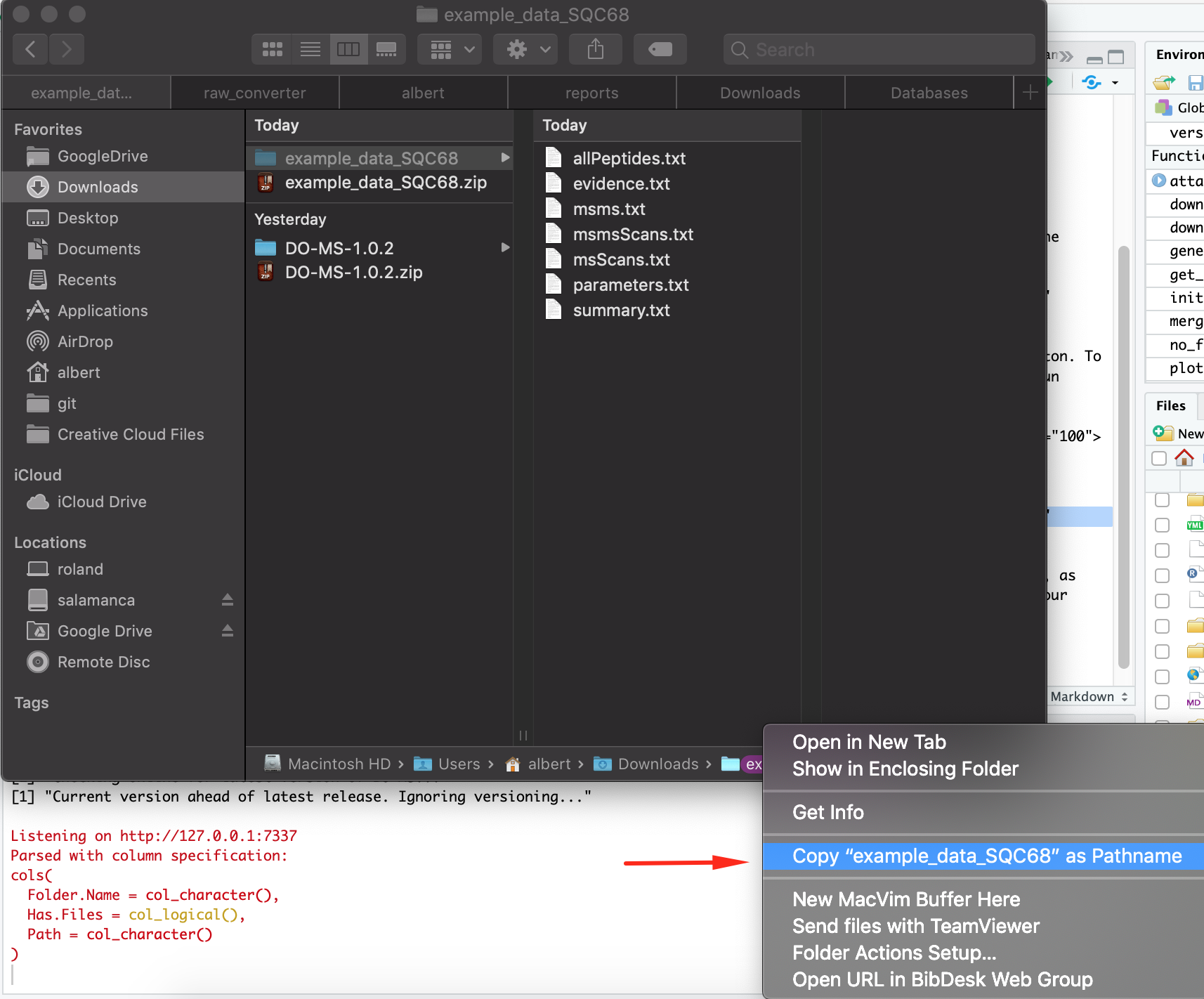
On Mac/OSX, you can get the folder path by right clicking on the folder at the bottom of the Finder application and hitting “Copy <folder){: width=”70%” .center-image} as pathname”.
Note that in the example above we checked “Add Single Folder” to add just the folder path we pasted in. If for example, you have a folder that contains many MaxQuant searches, you can select “Add Child Folders” to add all subfolders of the path specified, or “Add Recursively” to add all folders that are below the path specified.
Click “Confirm” and now you should see your folder added to the folder table
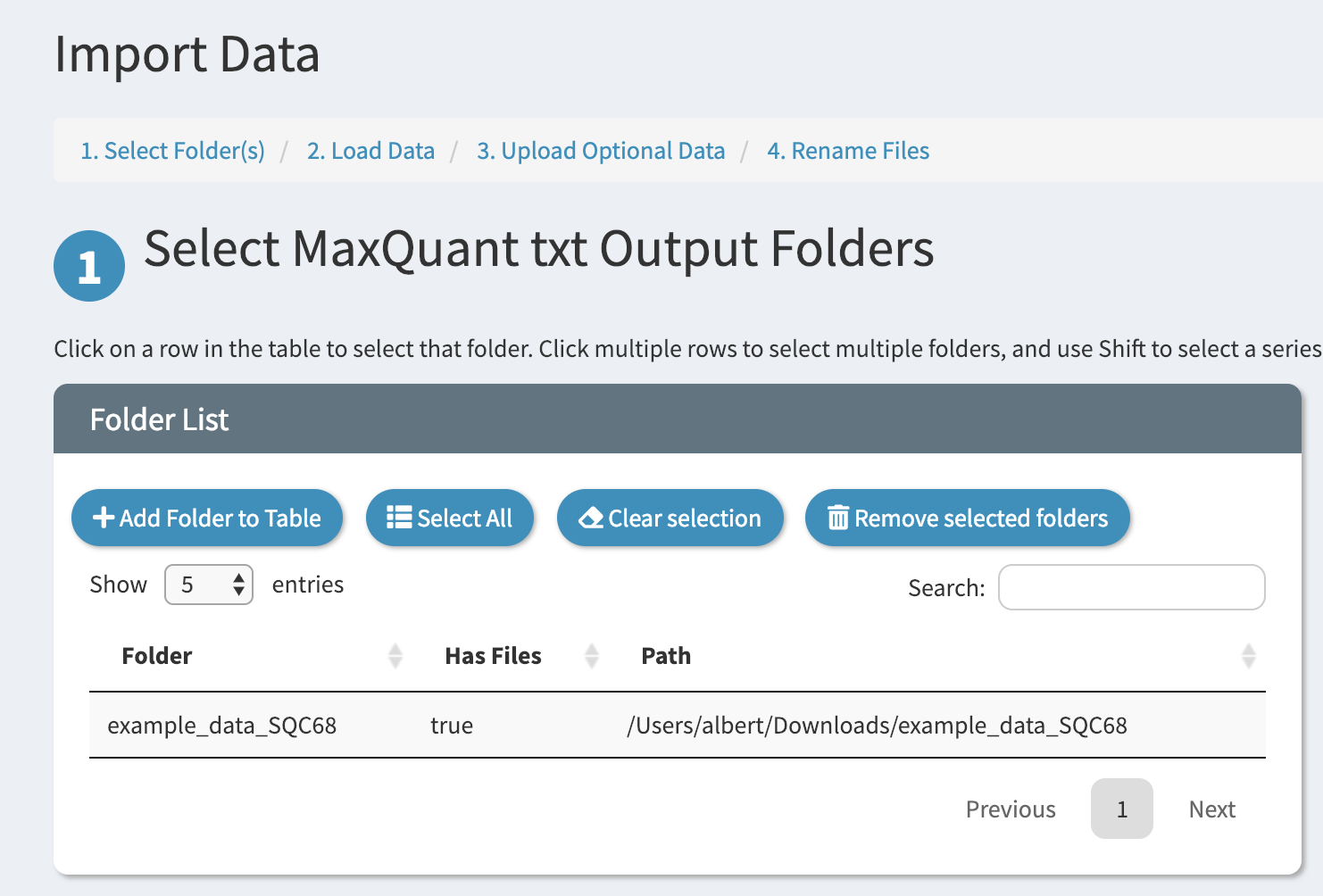
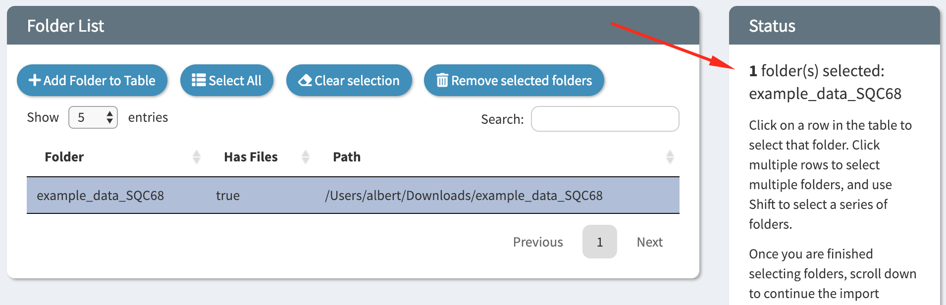
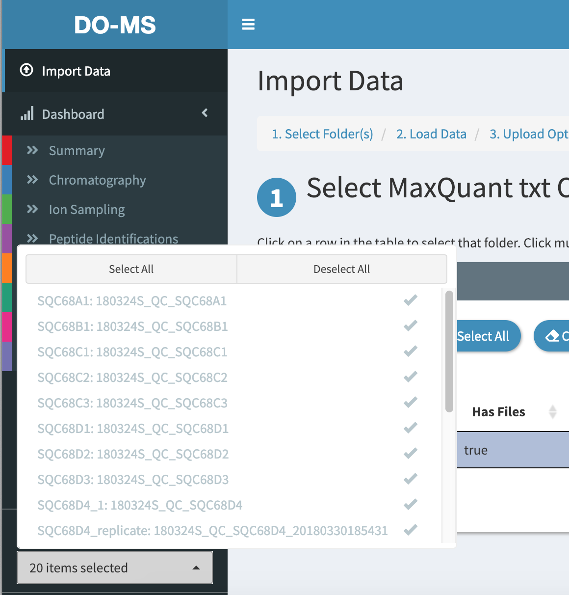
Click on the folder in the table to select it. When you have multiple folders loaded into the table you can select more than one. On the right the status bar will indicate which folders have been selected.
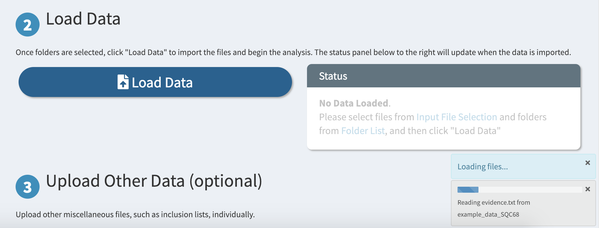
Finally, load the files from the selected folders by scrolling down and clicking on the big “Load Data” button
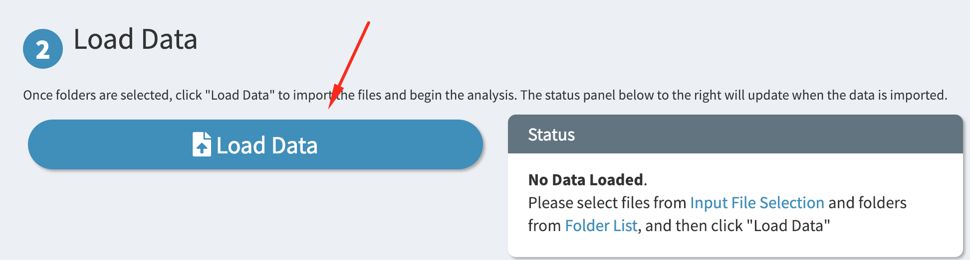
Depending on how large your files are, this may take a while. A progress bar on the bottom-right corner indicates the status of the import process.
Renaming Experiments
An important aspect of data visualization is easy-to-read labels for your experiments. DO-MS provides an accessible interface for renaming your raw file names so that generated figures will be easier to interpret.
Once your data is loaded, scroll down to the “Renaming Experiments” section. Here you will find a table of your loaded raw files and their associated “labels” that will be used when plotting.
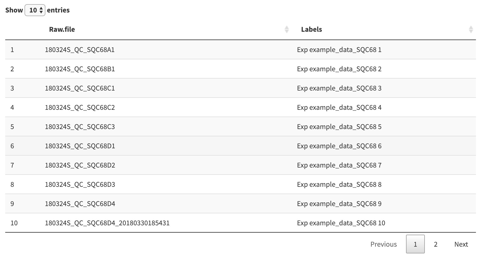
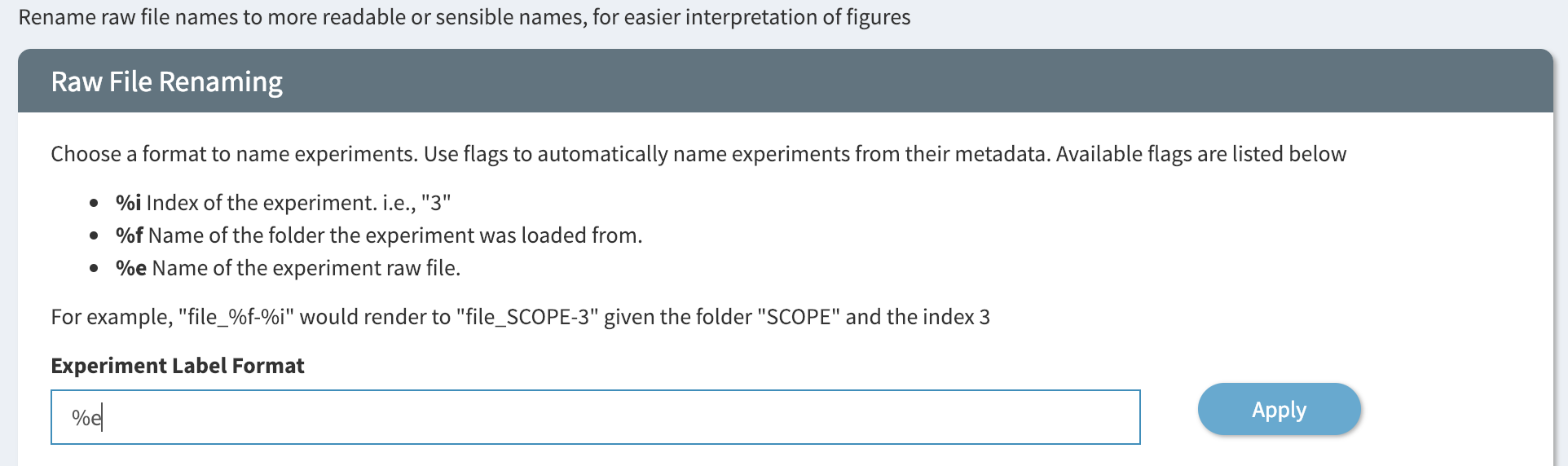
In the picture above the experiment labels are pretty long and contain a lot of unnecessary text. We can quickly change the format of all experiment labels by modifying the format which generates them. Scroll up slightly to the “Experiment Label Format” form to see how it was generated.
This format string is similar to a format string other programming languages, where the special characters %f, %i, and %e are replaced by raw file-specific strings. Since all of the raw files in the picture above come from the same search folder, we can change the format string to %e to have the label mirror the raw file name. Press apply to confirm the change.
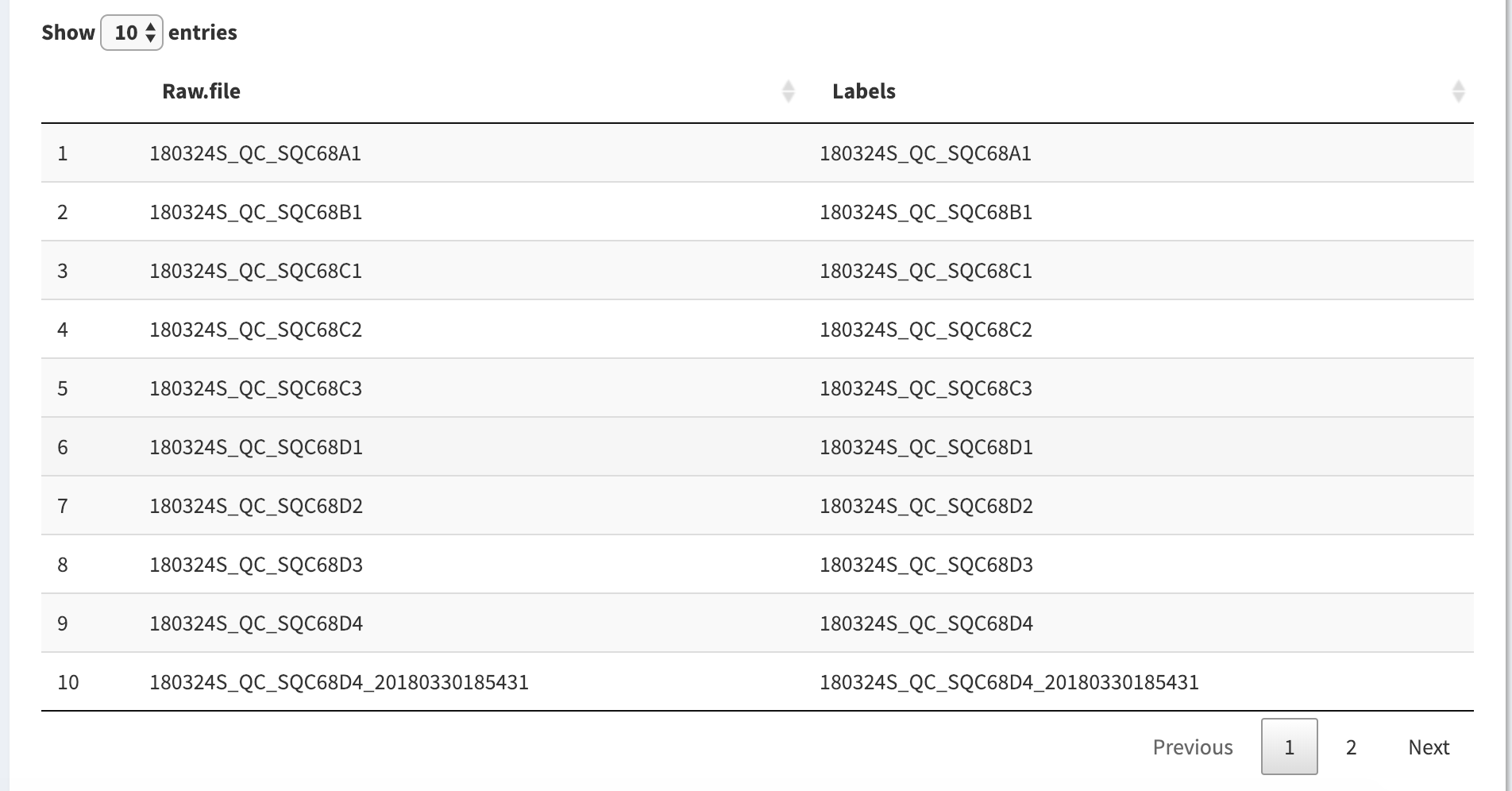
Now in the experiment renaming table below we can see the updated experiment labels.
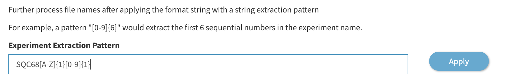
The labels are still pretty verbose though, and the portions of the raw file that indicate the date and type are not as important and the end of the raw file. We can further edit all the labels with a regular expression, as defined in the “Experiment Extraction Pattern” form above the table.
We can choose to extract the end of each raw file by providing a matching pattern. For example, the pattern below, SQC68[A-Z]{1}[0-9]{1} matches the string “SQC68”, plus one of any capital letter, and then one of any number. Click “Apply” to confirm the changes
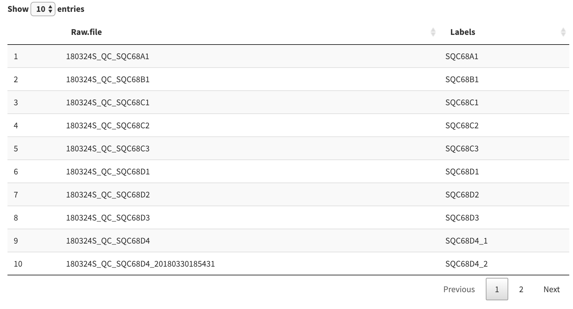
Our extraction expression resulted in a duplicate label, which was resolved automatically by appending _1 and _2 to the duplicate labels.
We can also edit the labels directly in the table. To explicitly name the duplicate, for example, click on the label entry in the table to access a text form to rename the label manually.
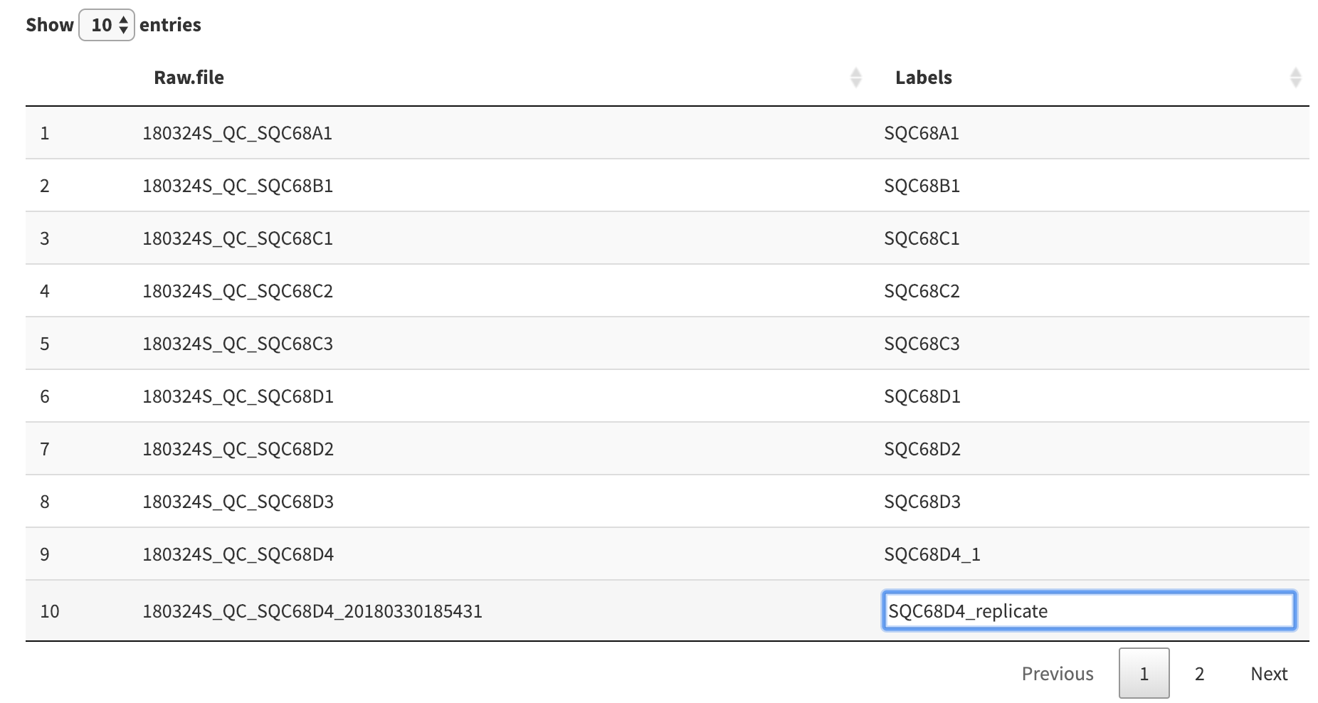
Once you are done editing, click anywhere outside of the table to save your changes.
Subsetting Experiments
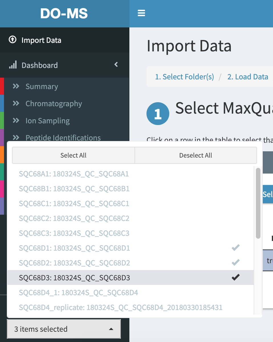
If we only wanted to look at, for example, SQC68D1, D2, and D3, we can choose to only plot those 3 experiments. In the sidebar, click on the white box below “Select Experiments to Display” to show which experiments are currently being plotted. By default, all are selected.
Click on “Deselect all” to un-select all experiments, and then click on SQC68D1, SQC68D2, and SQC68D3 to select just those 3 experiments.
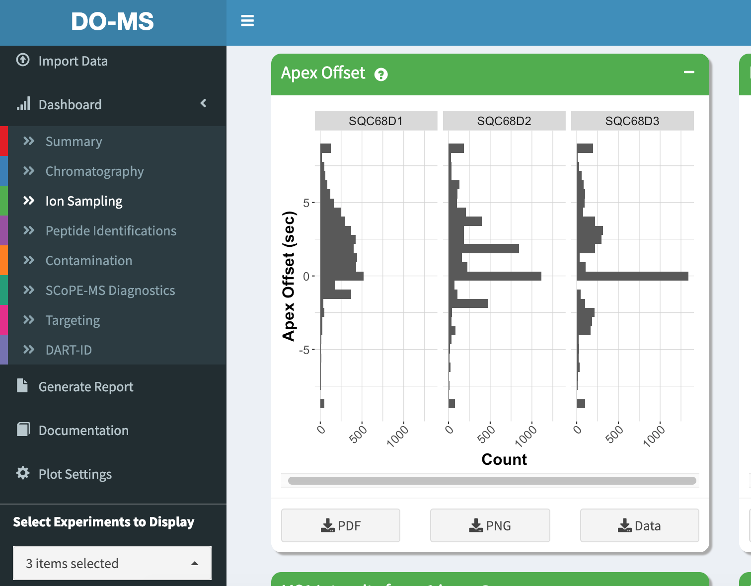
Now in our plots only these 3 experiments are shown
Interacting with Modules
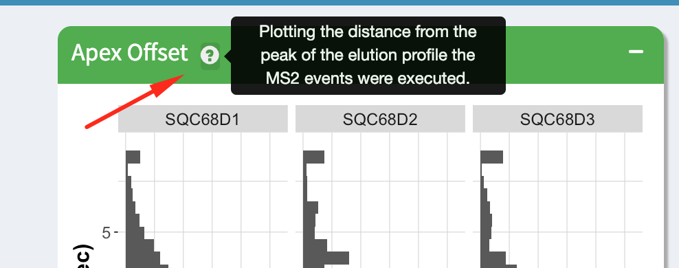
Each module has a short description that can be accessed by hovering over the question mark icon next to the module title.
You can also download the module plot as a PNG or PDF, by clicking on the download buttons below each module plot.

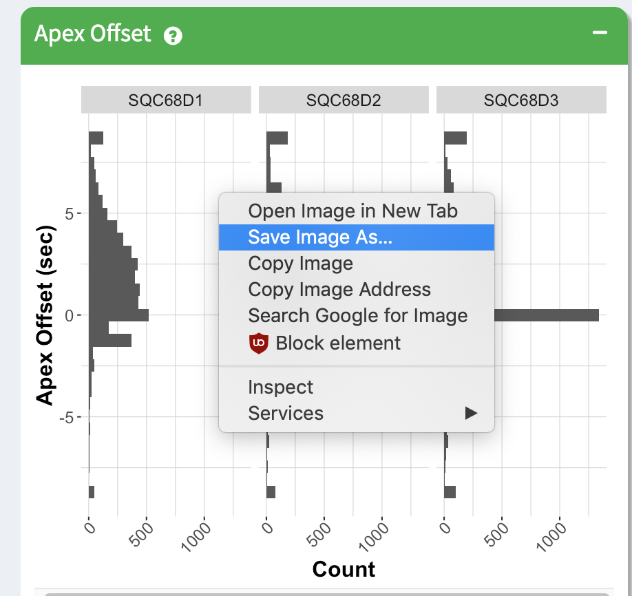
The image for each module can also be saved as-is by right clicking on the image and downloading it directly
You can also download the underlying data used for the plot by clicking on the “Download Data” button. This tab-delimited file can be imported into many other visualization packages.
Generate Report
Click on “Generate Report” in the sidebar to access the report generation page.
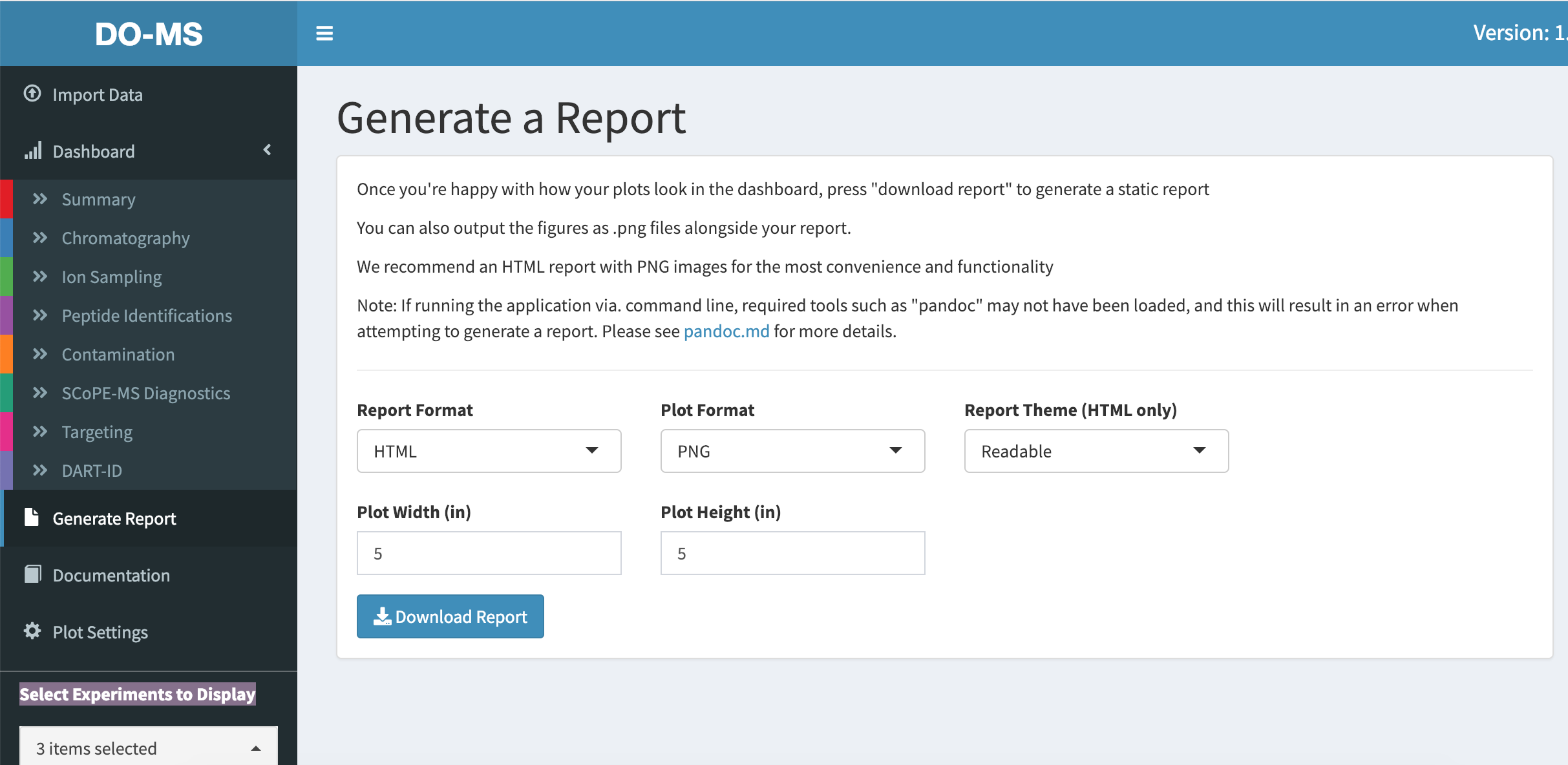
Here you will find some options to customize your report. While we support PDF reports and PDF images, we strongly recommend that you generate your reports in HTML format with PNG image plots. Other configurations may result in graphical glitches or unwanted behavior. In addition we recommend that you check your pandoc installation (more details here) as any issues will prevent the report generation.
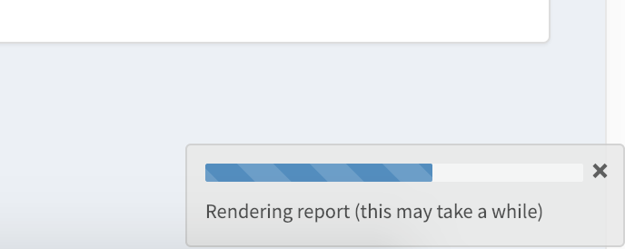
Click the “Download Report” button to begin generating the report. This takes a while as all plots have to be remade. A progress bar at the bottom of the page informs you of the progress.
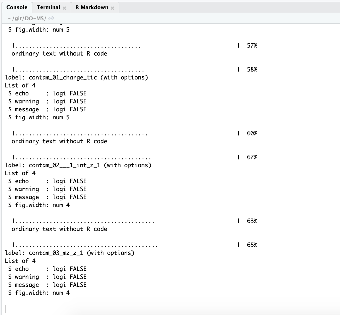
For the impatient, RStudio also prints some informative output and lets you exactly which plot it’s working on
Your report should download to your default download location.
All images in the report are embedded in the markup, so feel free to share this single file to your colleagues/collaborators and don’t worry about having to include anything else.